

PredictWind is the best tool for this and we're not pretending otherwise. But almost everything underneath it is public, and most sailors have no idea how much of it they could be running themselves.
Nothing here is autonomous and nothing here replaces your judgement. An AI can fetch a file, open an app and set up a calculation. It must never be the thing that decides your route or your course to steer.
AI gets things wrong, and it gets stubborn about it. It will give you a confident answer, accept a correction, then drift straight back to the same mistake. Offshore that is not an inconvenience. Every route gets checked by a human against the charts before anybody sails it.
It's simpler than it looks
Two inputs. A forecast, and how fast your boat goes.
Routing software takes a weather forecast laid out on a grid, takes a table of your boat's speed at every wind angle and strength, and then brute-forces the question: from here, where could I be in an hour? Then from each of those places, where in the hour after that? It fans outwards, hour by hour, until some of those paths reach the destination.
The one that gets there first wins. That's isochrone routing, and every router from the free ones to the expensive ones is doing a version of it.
Which means the quality of the answer comes entirely from the quality of those two inputs — the forecast, and your polars.
The forecast, as numbers instead of a picture
GRIB is just a file format — GRIdded Binary. A weather model divides the world into a grid, works out wind, pressure, waves and rain at every grid point for every few hours into the future, and writes that out as numbers.
That's the difference between a GRIB and a weather map. A map is a picture somebody drew for you. A GRIB is the raw data, so your software can compute with it.
They are also small, deliberately. You can ask for just your patch of ocean, just wind, just the next three days, and get a file measured in kilobytes — which matters enormously when your connection is a satellite link or an SSB radio.
Software draws it as arrows on a map. Each arrow sits on one grid point and says what the wind is doing there at one moment:
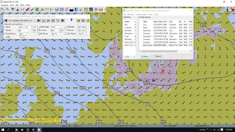
And the real thing: OpenCPN with a GRIB loaded. The arrows are the wind at each grid point, and the dialog on the right steps through time.
Two things are encoded in every arrow, and they are the only two things you need to read one:
| What | How it's drawn |
|---|---|
| Direction | The shaft points the way the wind is going. The feathers are on the upwind end — so the feathers are the end the wind comes from. |
| Speed | Counted in feathers on the shaft. A short feather is 5 knots, a long one is 10, and a solid triangle is 50. Add them up. |
So a shaft with one long feather and one short is 15 knots. Two long is 20. A triangle and two long is 70, and you should be somewhere else.
In the grid above, the wind veers across the picture — the arrows rotate steadily — and strengthens towards the bottom right, where the feathers multiply. Color is just the software shading speed to make that obvious at a glance.
That's it. A GRIB is this grid, repeated every three or six hours into the future. Scrub the time slider and the arrows wheel and grow as the system moves across. Routing software doesn't look at the picture at all — it reads the numbers behind each arrow.
GFS is the American global model, run by NOAA, and it is free to everybody. ECMWF is the European one, generally considered better, and historically the expensive one. The paid services largely sell you access to more models, higher resolution, and a nicer way to compare them.
The part nobody tells you
GFS data is public. You are allowed to have it. You do not need a subscription to get a forecast.
Then open them in qtVlm, OpenCPN or Freeboard SK — all free — and you have a routing setup that cost you nothing but the download.
Not what the weather will do. What it has always done.
A GRIB tells you about next Tuesday. A pilot chart tells you what November is like in that patch of ocean, based on every ship that has ever crossed it. For deciding when and where to go, the pilot chart matters far more.
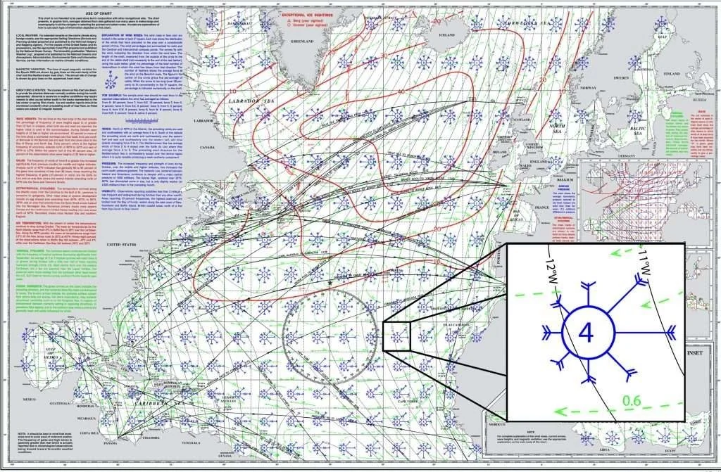
A pilot chart, with one of the many wind roses enlarged in the inset. How to read it is below.
In the 1840s a US Navy lieutenant named Matthew Fontaine Maury was put in charge of a depot full of old ships' logbooks that nobody had any use for. He realised that each one contained a day-by-day record of wind, current and weather at a known position — and that thousands of them, added together, would describe the ocean itself.
He had them transcribed and averaged, and in 1853 published the first pilot chart of the North Atlantic. Captains who used it found routes that cut weeks off a passage. In exchange for a copy, he asked them to send back their own logs — so the charts improved with every voyage that used them.
They have been accumulating ever since. Over a hundred and seventy years of observations, now including satellite and buoy data. When you read one, you are reading the collected experience of an enormous number of people who went before you, most of whom had no engine.
One chart per ocean per month. You want the month you intend to be there, and the two either side of it.
The chart is covered in small circles, one for each five-degree square of ocean. Each one is a wind rose, and it is the densest piece of information on any chart afloat.
| Part of the rose | What it tells you |
|---|---|
| Which way the arrow flies | The arrow flies with the wind, pointing in towards the center. The feathered end is the direction the wind blows from. An arrow coming in from the north-east is a north-easterly. |
| Length of the shaft | How often the wind blows from that direction, as a percentage of all observations for that month. Longer = more of the time. Above about 25% the number is printed on the shaft instead. |
| Number of feathers | How hard — the Beaufort force most frequently recorded from that direction. One feather per force, so five feathers means Force 5 is the usual strength from there. |
| The number in the middle | Percentage of calms — under Force 2 — usually printed in blue. A red figure is the percentage of storms, over Force 7. A high red number is the chart telling you not to be there that month. |
Read the rose above and it says: this square, this month, is a north-easterly place. It blows from the north-east most of the time at about Force 5, sometimes from the east a bit lighter, rarely from the south-west, and it's dead calm 7% of the time. That is a trade wind square, and you'd want it behind you.
A square showing 80% north-easterlies at Force 5 will still hand you three days of calm or a gale from the south-west. The chart tells you what to plan for. It cannot tell you what you will get.
And the climate these were compiled under is not entirely the one we are sailing in now. Treat the long record as a strong guide, not as a guarantee.
Your boat's speed, as a table
A polar is just: at this true wind angle and this wind speed, this boat does this many knots.
Plot it and you get the familiar lopsided shape. Dead downwind is slow. Close-hauled is slow. Somewhere around a broad reach is where most boats do their best work, and the polar shows exactly where.
Routing software lives or dies on this table. Feed it an optimistic polar and it will route you as though you're a racing boat, promise a four-day passage, and leave you short of a weather window.
Nobody published polars for a forty-year-old heavy-displacement ketch. So you build your own, and the data is already going past you: log true wind angle, true wind speed and boat speed every few seconds on every sail you do, then take the median for each combination.
After a season you have a polar that describes your boat with your sails and your bottom — which is worth far more than the designer's numbers.
And be honest with it. A cruising polar should reflect what you'll actually carry at two in the morning with two people aboard, not what the boat could theoretically do fully crewed in daylight.
A careful line
The useful part is the donkey work. Fetching the right GRIB for the right area, loading it, setting up the calculation, logging sail data to build the polar, comparing a few departure times and summarising what changed. All of that is tedious and all of it is safe to automate.
What it must never do is decide. The route it hands you is a proposal. A human checks it against the charts for depth, hazards and traffic, checks the weather assumptions still hold, and makes the call.
That distinction is the whole thing: AI operates the tools, people make the decisions.
And you should be sharing it
You already measure wind, pressure and temperature. That data is worth something to everybody around you.
Forecast models are only as good as the observations fed into them, and the ocean is enormous and almost empty of sensors. A boat offshore reporting real pressure and real wind is genuinely rare data.
The boat's own weather station is an Ecowitt, and it is not just feeding our screens — it is a public weather station.
Once you register it, its readings are published and anybody can look at them. Temperature, humidity, dew point, pressure, wind, rain — live, from this boat, on a map, to anyone who wants it.
And here's the part most people don't realise: there are thousands of other people doing exactly the same thing. Not an official network — houses, farms, docks and boats all over the country, each with a cheap station on a pole, all sharing.
Which means you can look up somebody's personal station twenty miles upwind of you and see what the weather is actually doing there, right now. Not a forecast for the region. A real anemometer, on a real pole, in the place the weather is coming from.
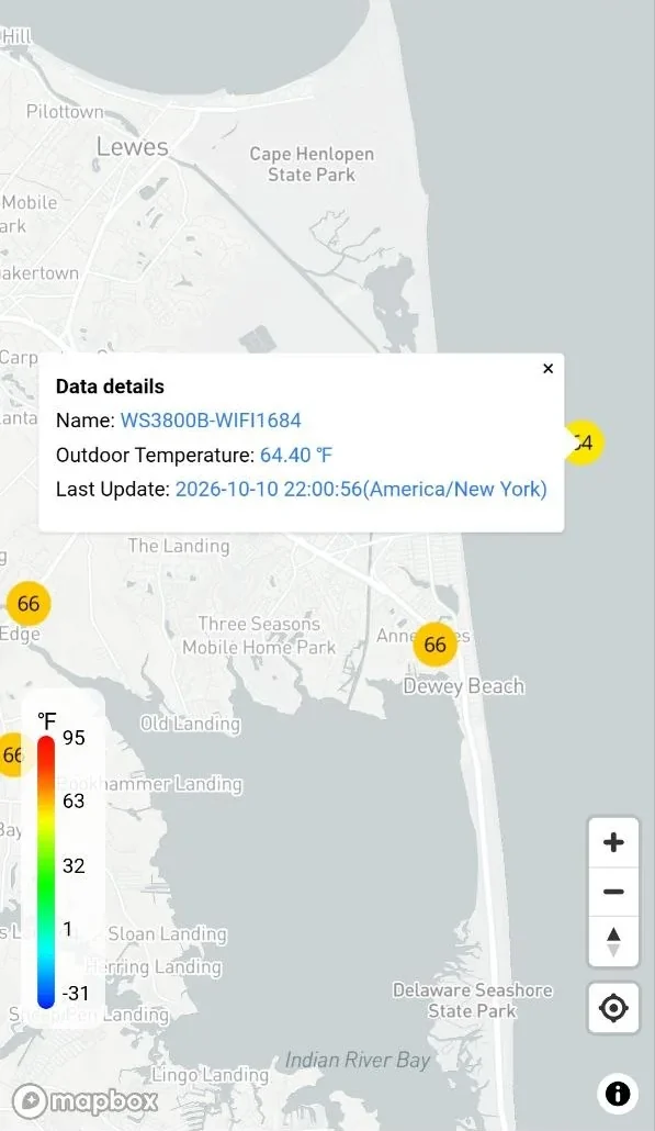
It costs nothing, it needs no attention once it's set up, and it makes every forecast in your area slightly better including your own. If you have a weather station aboard and you are not sharing it, switch it on.
The same readings go to Weather Underground and Windy as well, so one sensor feeds three networks.
To see the map: sign in at ecowitt.net or in the Ecowitt app and open its weather map. Choose which reading to show, such as outdoor temperature, and every station reporting that reading appears as a dot. To get your own on it, check your station's location in the app (Menu, Device, the edit button, then the map icon) and drag it to the right spot, because the default is only a rough guess from your IP address.
See the Ecowitt map → ecowitt.net Wundermap — see everybody's stations
Windy accepts data from personal weather stations, and a boat counts. Exodus sends hers up automatically — the instruments feed Signal K, and a Signal K plugin pushes the observations to Windy. Once it's configured it simply runs.
It costs nothing, it takes an evening to set up, and if you're already running Signal K you have everything you need.
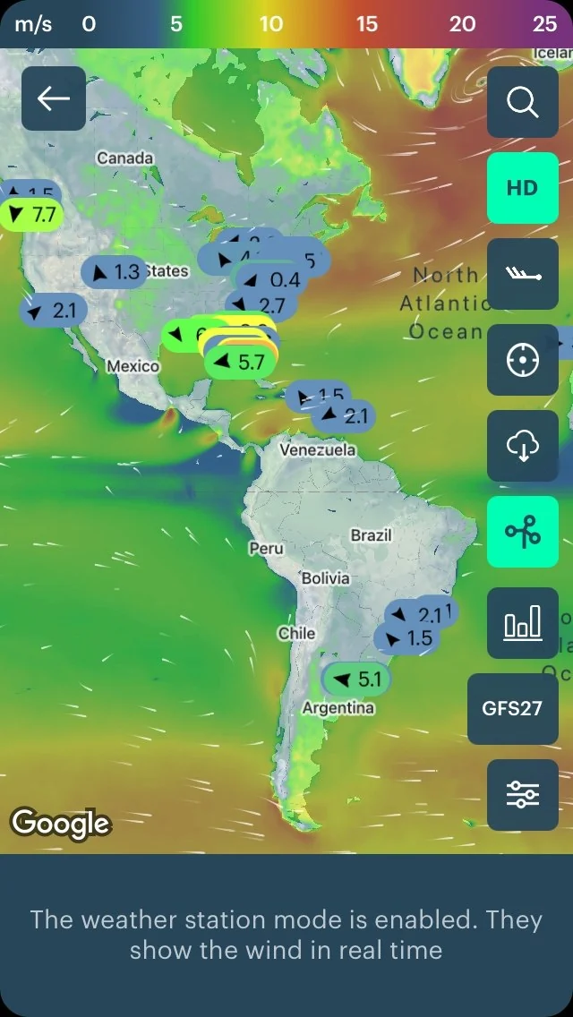
Windy in its weather station mode: every dot is a station reporting the wind in real time. Boats count too.
You choose whether your station is published openly. Windy's own instructions: stations.windy.com/docs.
Everything above arrives over the internet. The one source that doesn't is a weather satellite image received directly — and on this boat it is still a work in progress.
The polar-orbiting NOAA satellites broadcast cloud imagery in the clear, around 137 MHz, as they pass overhead. With a cheap SDR dongle and the right antenna you receive it directly, with no connection of any kind.
If it worked, it would change the forecasting picture offshore in three ways:
The capture chain is built and automated. The images are unusable, because we have not found an antenna that works on a boat with two masts in the way. The full honest write-up is here →
Here's the idea. Ten boats offshore within a few hundred miles of each other, each measuring real conditions, each sharing them. Not a forecast — what is actually happening, right now, where other boats actually are.
A model tells you what it thinks the wind will do. Another boat forty miles upwind tells you what the wind is doing. On passage that second thing is worth more, and the pieces to build it already exist.
That one's on the list.
Straight answer
Yes, and we pay for it.
They run their own high-resolution models, they have the computing power behind them, and for a real passage decision that is what we use. We're not going to pretend a free stack matches it.
But "the best tool costs money" and "you can't do this without paying" are different statements. The forecast data is public. The routing maths is well understood. The software is free. If the budget isn't there, you are not locked out of weather routing — you just have to understand it a bit better.